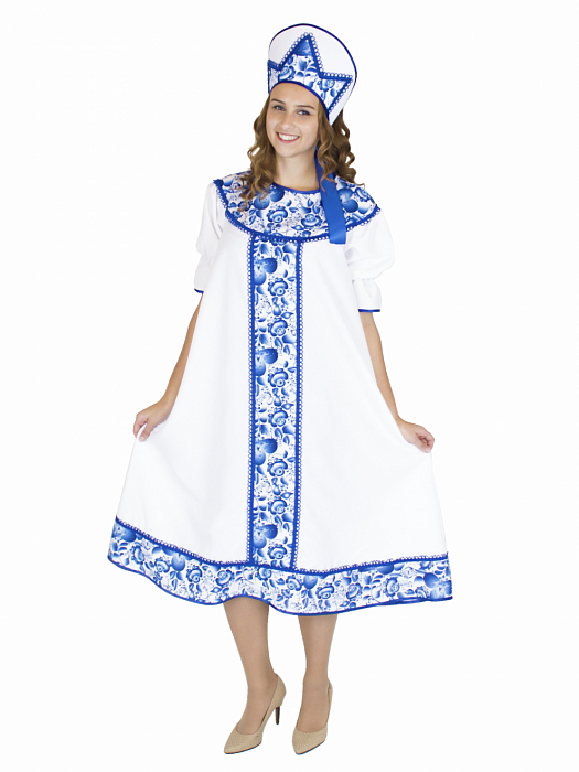
Gzhel is a traditional Russian folk art that emerged in the 18th century in the eponymous village near
Moscow (Russia). Its core visual codes include a vivid blue-and-white palette characteristic of ceramics, along
with stylized depictions of plants, animals, and geometric patterns. Gzhel ceramics were originally
created as utilitarian tableware but gradually acquired the status of decorative art.
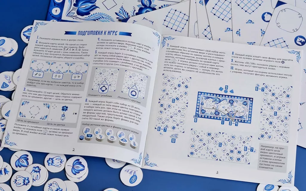
Gzhel’s visual references appear across media—from ceramics and porcelain painting to fine art and print graphics.
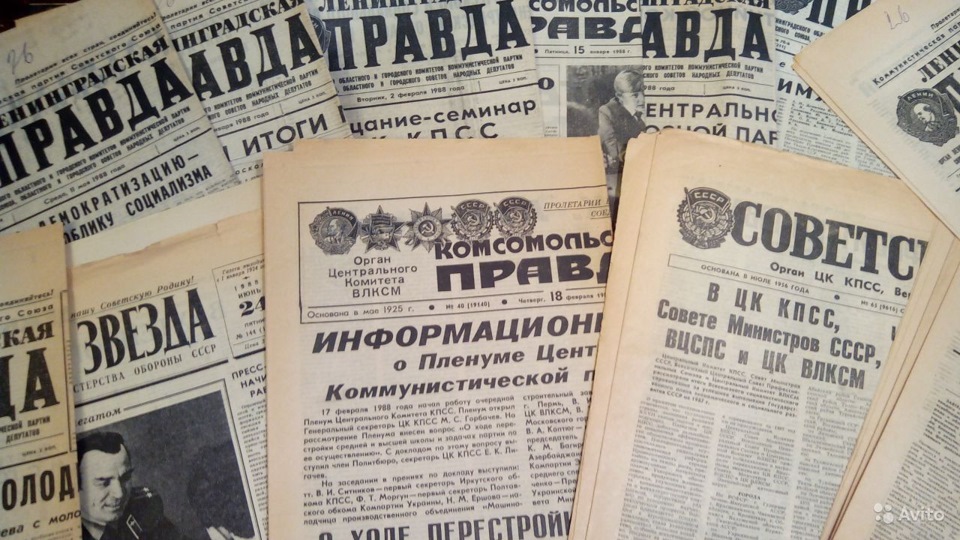
In the late 19th to early 20th centuries, illustrated periodicals and ornament albums frequently featured
folk-art motifs aligned with the Gzhel tradition. Architecture and interior design likewise absorbed these codes:
ceramic panels, stove tiles, border ornaments, and “cobalt” accents in interior finishes.
1.2 Theme Concept & Key Metaphors
Semantic foundation
Gzhel is treated as a system of visual codes representing tradition, craftsmanship, and
nature-inspired imagery.
Tone of communication
Low-arousal, friendly, and free of visual noise; clarity takes priority.
Color system
A white base background; blue (cobalt) tones for accents, frames, and dividers; avoid
saturated backgrounds under running text.
Ornament and textures
Patterns inspired by Gzhel ceramics are used sparingly: as borders, corner vignettes, and fine
dividers, not as solid backdrops.
Readability of long texts
Gentle hierarchy, predictable structure, and even line spacing and paragraph gaps to reduce
cognitive load.
User comfort
Components and interactions must be intuitive; visual decisions should support a sense of calm
and homely warmth.
Usage constraints
Ornament is not used as a background for paragraphs and forms; accent colors are applied
moderately to avoid overload.
1.3 Visual System
1.3.1 Color Palette
Role
HEX
Swatch
Contrast on white
Notes
Headings & primary accents
#003399
10.86:1 — AAA
Deep “cobalt ink” for hierarchy and brand anchors.
Body text
#636060
6.23:1 — AA
Neutral warm gray reduces glare vs. pure black.
Secondary accents & links
#0055cc
6.62:1 — AA
Vivid link color; use for large text/controls.
Secondary accents & links (alt)
#3439c0
8.43:1 — AAA
Use when AAA is required for small link text.
Buttons (fill)
#3b40d9
White text on #3b40d9: 7.19:1 — AAA
Solid “ultramarine” button; pairs with white text.
Background
#ffffff
—
“Porcelain white” base, echoing ceramic glaze.
Í›
Usage guardrails:
No more than two shades of blue on screen at once; solid blue backgrounds
under long-form text are prohibited. This preserves readability and the historical
“accent” status of blue.
1.3.2 Typefaces
Headings
A la russ — used as a display face to convey folk-art authenticity and
ceremonial tone.
Body text
Balkara — used for continuous reading, prioritizing clarity and
balanced texture.
Typeface selection acknowledges folk traditions to achieve authenticity: an expressive display face
for headings and a neutral, readable face for UI copy.
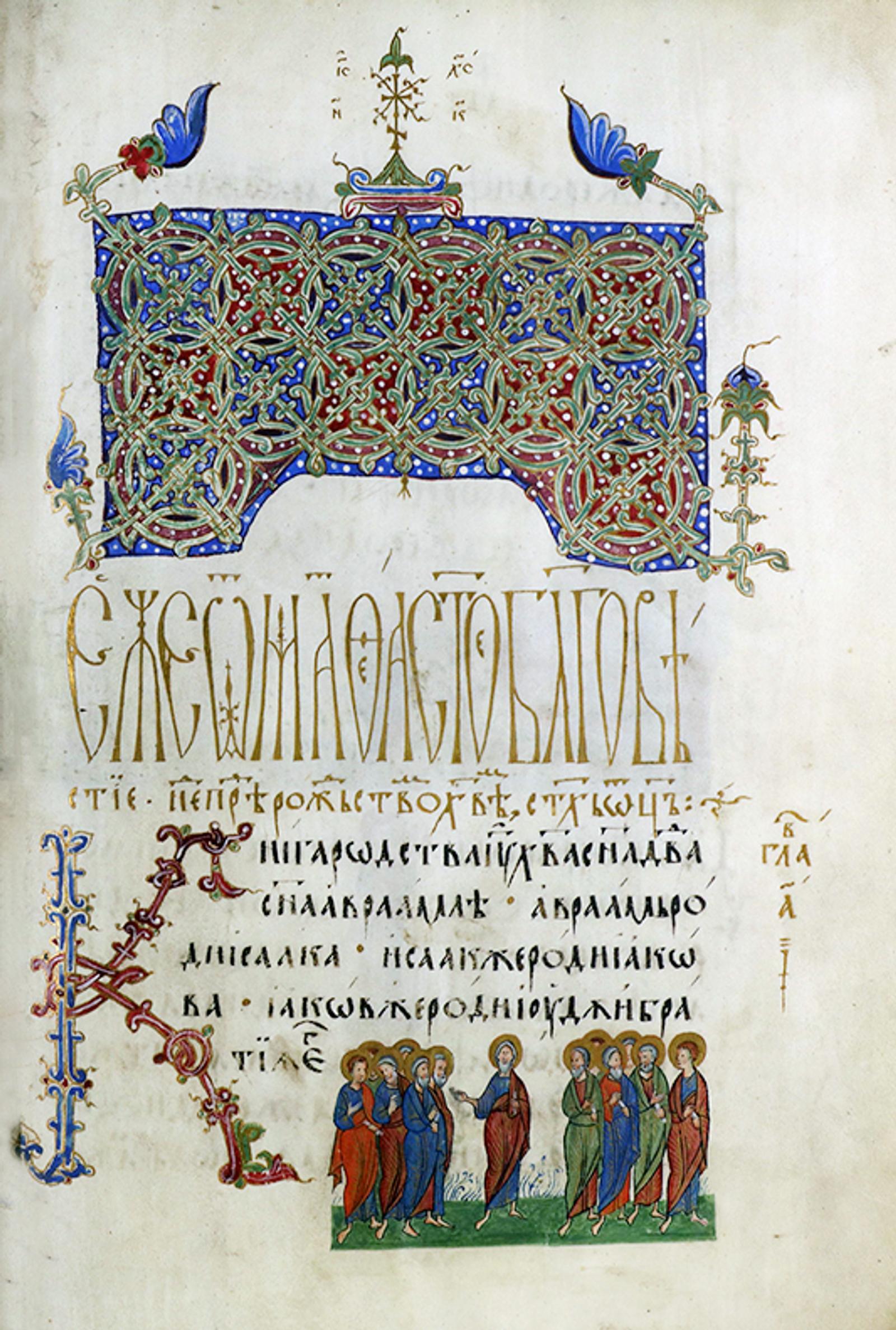
Initial (Drop Cap)
The initial letter—adopted from the Russian manuscript tradition and cognate with Gzhel’s ornamental
culture—is integrated to heighten textual expressiveness. It may be used at the start of editorial
articles and essays; it is not applied in forms, tables, or compact UI layouts.
Reference: ornamental initial from Russian
decorative tradition (for mood and proportion only).
1.4 Layout
Page Composition and Reading Flow
The page layout follows a traditional book logic. Text is set as a continuous flow to facilitate effortless reading,
with each new paragraph or section clearly separated from the previous one. Vertical balancing of page elements
maintains a sense of calm and order. The absence of superfluous graphics and motion results in a clean, concise
presentation that keeps attention on the content.
To reinforce historical authenticity, page-opening ornaments are sourced from Old Slavic
manuscripts and transformed via an AI-assisted pipeline. They were extracted, cleaned, and
recolored to align with the theme’s colour vocabulary.
Edge Treatments and Visual Lightness
To introduce visual lightness, rounded geometry is employed consistently: buttons use a fixed corner radius of
50 px, while images adopt an elliptical radius of 100px 20px 90px 25px / 20px 80px 30px 100px. The latter creates a gentle, asymmetrical silhouette that
echoes hand-finished ceramics rather than industrial uniformity.
Iconographic Motif: Gzhel Plate and Book Spread
To reinforce authenticity, the map is rendered as a Gzhel-painted plate—a familiar domestic object in Russian
material culture—while the main text is arranged as a book spread. Additional decorative devices include
article labels and the site footer, each delineated with a border that references Gzhel-style ornament.
Triangular Closing Paragraph
The final paragraph of each article employs a triangular composition: the text emphasizes key aspects of
Russian culture and gradually narrows toward the center, producing a focused visual effect. This is achieved by two
floating elements that shape the text using shape-outside:
Meta-information is positioned to the right of the main content. This arrangement strengthens the book-spread metaphor
and improves the efficiency of information retrieval within the text.
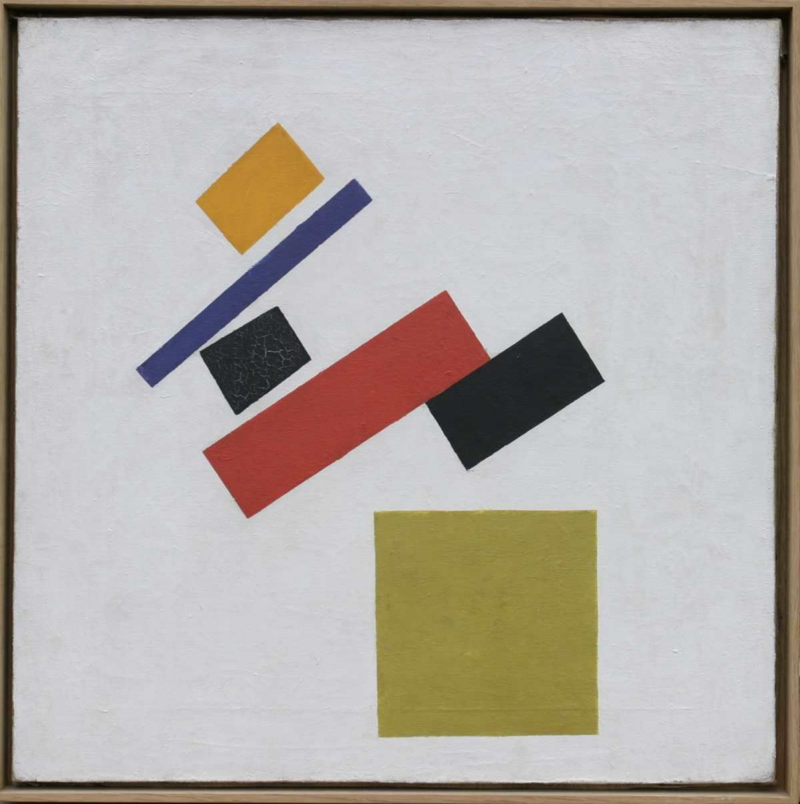
Suprematism
Inspired by the First half of 20th Century
2.1 Historical and Cultural Rationale
Suprematism and the Russian avant-garde emerged in the early 20th century amid profound social
and political change, including World War I and the Russian Revolution. These movements pursued
a new way of seeing, rejecting traditional forms and materials. Their core visual codes include
pure abstraction, geometric shapes, radical reduction, and a limited palette—black, white, and
primary colors (yellow, red, blue).
The period’s visual references span painting, experimental typography, architecture, poster
design, and editorial illustration. Works by Kazimir Malevich, Wassily Kandinsky, and El
Lissitzky are foundational. Fashion and illustrated magazines of the era often featured
geometry-driven layouts and abstract motifs influenced by Suprematism and the broader
avant-garde.
Key metaphors include “breaking the old,” “seeking a new language,” and “liberating form.”
In interface terms, this translates into an emphasis on simplicity, clarity of line, and
geometric order—principles consistent with Suprematist and avant-garde philosophy.
2.2 Theme Concept & Key Metaphors
Semantic foundation
Suprematism and the Russian avant-garde are interpreted as systems of non-objective geometry,
radical reduction, and functional clarity.
Tone of communication
Direct, precise, and free of ornament; the interface favors economy of means, legible structure,
and unambiguous affordances.
Color system
A limited palette—primarily black, white, and red (optionally extended with primaries)—supports
high contrast and visual discipline; avoid gradients and textured fills, and do not use saturated
backgrounds under running text.
Geometry and layout
UI components are reduced to basic shapes (squares, circles, lines) and clear alignments;
asymmetry and diagonal tensions may be used sparingly to create dynamism without impairing
legibility.
Form reduction & UI minimalism
Elements are simplified to essential form and function to produce an intuitive interface: minimal
labels, clean iconography, and states indicated by contrast rather than decorative effects.
Contemporary relevance
Suprematism and the avant-garde profoundly shaped early-20th-century art, design, and fashion;
translating their principles into today’s interfaces yields distinctive, expressive solutions while
honoring the period’s cultural legacy.
Usage constraints
Limit accent colors on a single screen; avoid skeuomorphic textures and heavy shadows; maintain
accessibility (AA/AAA) for text on colored grounds.
2.3 Visual System
2.3.1 Color Palette
Role
HEX
Swatch
Contrast on black
Notes
Headings & primary accents
#d4af37
9.99:1 — AAA
Gold for hierarchy; works for normal text and small UI elements on black.
Headings & primary accents (alt)
#ff0000
5.25:1 — AA
Constructivist red; use for headings and large controls; not AAA for small body text.
Body text
#dedede
15.61:1 — AAA
Soft light gray improves readability vs pure white glare.
Secondary accents & links
#191970
1.41:1 — Fail (on black)
Use only on light surfaces (on white it’s 14.85:1 — AAA) or pair with a light chip/pill background.
Background
#000000
—
“Black Square” backdrop — reference to Kazimir Malevich’s 1915 painting — keeps the palette minimal and high-contrast.
Contrast ratings follow WCAG 2.1 for normal text (AA ≥ 4.5:1, AAA ≥ 7:1).
2.3.2 Typefaces
Headings:
"Rodchenko Constructed", "Rodchenko Grotesk" — used as display faces to convey Constructivist
rigor and geometric clarity.
Navigation:
"Next Art" — used for menus, tabs, and system labels; compact metrics and clear forms support
fast scanning at small sizes.
Body text:
"News Cycle" (semibold) — used for continuous reading on a black background; the weight delivers
stable contrast and a balanced texture.
Typeface selection acknowledges the avant-garde heritage to achieve authenticity: assertive display
faces for headings, a utilitarian, legible sans for navigation, and a steady, high-contrast text face
for UI copy.
2.4 Layout
Geometric Header Composition
To convey period authenticity while signaling a deliberate break from ornament, the site header is
constructed as a geometric composition. It relies on simple primitives (squares, circles, lines),
clear axes (orthogonal and occasional diagonals), and measured negative space—keeping vertical
real estate free for the reading areas.
Columnar Typesetting (Newspaper Logic)
The body copy is set in a newspaper-style multi-column layout. An even column count is prioritized—
two columns on mobile and four on desktop. Even columns aid line-tracking for left-to-right reading
and split long texts into manageable blocks, improving comprehension and scanability.
Column Gaps and White Space
Inter-column spacing follows a functional range of 0.2–0.5 in (≈5–12 mm). In this system the gap is fixed at
2 rem, providing enough separation to prevent visual merging of adjacent columns without wasting page area.
Generous white space around text and between columns reduces cognitive load and improves legibility.
/* Minimal implementation */
.article {
    column-count: 2;    /* mobile */
    column-gap: 2rem;   /* ≈32 px; within the 5–12 mm guidance on common DPIs */
    hyphens: auto;      /* smoother rags for multi-column text */
}
@media (min-width: 1024px) {
    .article {          /* desktop */
        column-count: 4;
    }
}
.article p {            /* avoid paragraph splits across columns */
    break-inside: avoid;
}
3.4 Motion System
The motion language follows three principles: geometry first (shapes move as squares,
circles, and lines), linear time (constant velocity, no elastic overshoot), and
non-interpenetration (objects do not pass through one another). Depth cues—parallax,
drop shadows, faux perspective—are deliberately avoided to honor the period’s flat,
non-illusionistic space.
Artwork Overlays
To evoke the era, selected images receive geometric overlays that quote well-known avant-garde
compositions. Overlays sit on top of the base image and reveal in simple wipes or
slices; they never morph or blend as “material,” preserving the autonomy of forms. Use
hard-edge masks, limited opacity, and linear timings.
Footer Loop: Non-Intersection Sphere
The site footer features a looping background animation of a sphere that traverses the horizontal
axis. The motion illustrates the principle of bodies that do not intersect: the sphere
“bounces” at boundaries rather than passing through content. The path is planar and
perspective-free, reinforcing linear placement without depth.
In the animation above, the object changes position, varies its opacity—periodically entering and exiting the scene—
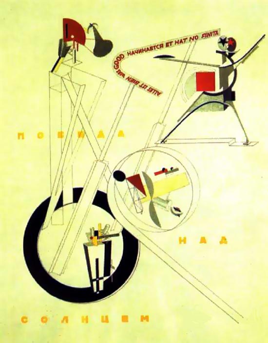
and rotates about its axis. This sequence nods to the cubo-futurist opera Victory over the Sun (1913),
often cited as a precursor to Suprematism through Kazimir Malevich’s scenography. The motion remains planar and
non-illusionistic: constant velocity, crisp edges, no depth cues.
Referential Motif: “Victory over the Sun” (1913)
Summary
Although Gzhel and Suprematism are distinct artistic practices with different aims and contexts,
they can be compared across several criteria, including aesthetics, cultural significance, and
reception. Both articulate unique facets of Russian culture, yet they do so through markedly
different lenses.
Gzhel
Functions as a symbol of Russian folk culture and tradition, maintaining
a historical link to everyday craft and domestic art. Its reception is closely tied to feelings
of warmth, homeliness, and continuity, often evoking a nostalgic affinity with Russian cultural memory.
Suprematism
By contrast, pursues
purity of form and the liberation from representational content. The reception of Suprematist works tends to be
more intellectual and conceptual, inviting the viewer to consider relationships of form and color and the meanings
they may suggest.
Cultural register: Gzhel—folk craft and domestic tradition; Suprematism—avant-garde experiment and rupture.
Sensory tone: Gzhel—warmth and familiarity; Suprematism—clarity, austerity, and conceptual focus.
Implementation note.
In both themes, the site header employs the Bootstrap library to streamline the
markup and behavior of dropdowns and popovers, ensuring consistent interaction patterns across
breakpoints.
A production-ready desktop layout is included, and responsive variants for devices of varying
screen sizes (mobile and tablet) adapt typography, spacing, and hit targets accordingly.
The purpose of this web site is to explore various types of typographic and layout style for text
documents, as an end-of-course project for the "Information Modeling and Web technologies" course of
the Master Degree in Digital Humanities and Digital Knowledge of the University of Bologna, under
prof. Fabio Vitali. The documents contained in this web site have been selected for their length and
complexity from their respective source publications. Their publication here is not intended to be
an alternative or replace their original locations:
All copyrights and related rights on the content remain with their original owners. All copyright on
the typographic and layout choices are owned by their respective creator or the entity that
commissioned the work.